by Rachel Raymond
Whether you want to improve your logo design skills or are searching for a designer, keep these tips in mind.
1: Strong Content
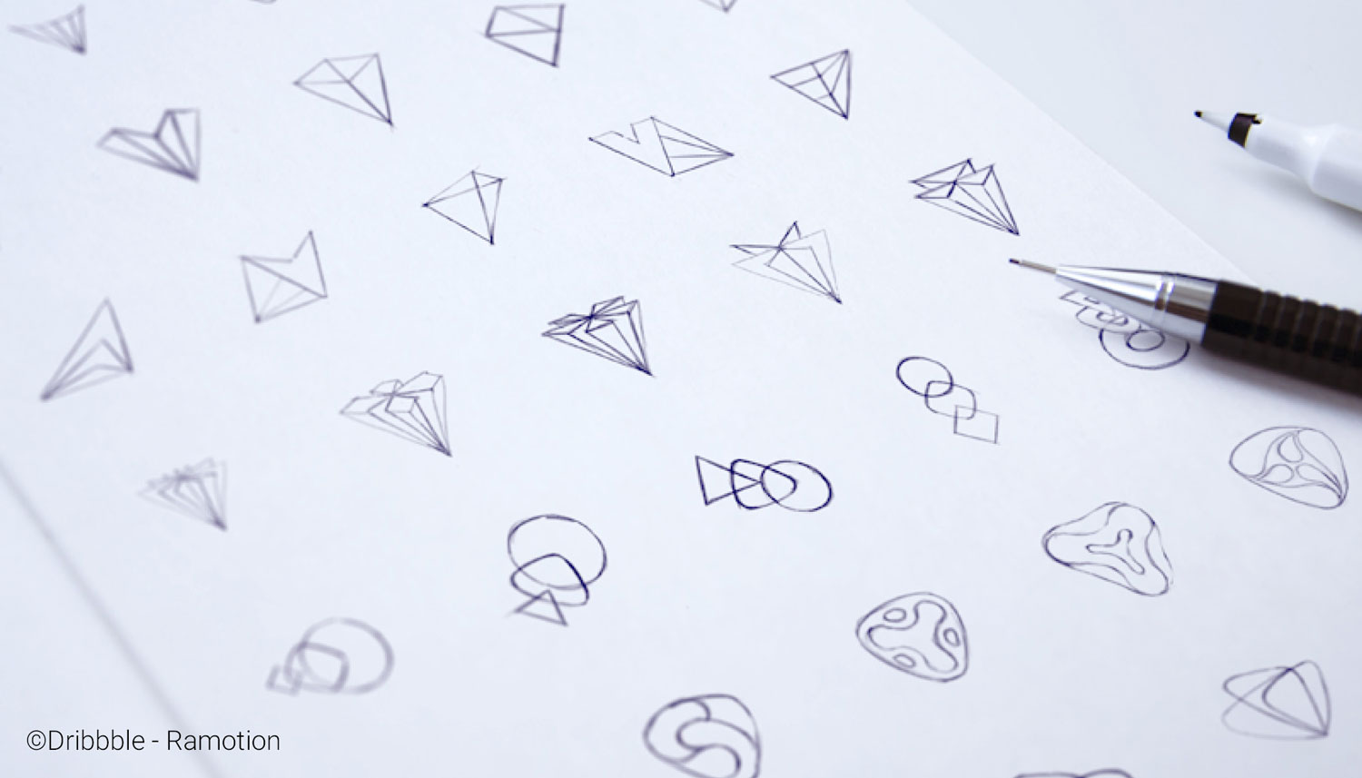
Generate several ideas, having each new concept building off of another. By doing this, most designers can think of a more evolved, less obvious concept that better aligns with the client’s brief. Concepting doesn’t always have to happen this way. Sometimes the most simple and best solution is the first concept, but it’s a rare occurrence. Most sources tell you to create fifty to one-hundred sketches before you find the right solution.
2: Careful Craft
I can’t stress enough to make sure your linework is clean. Make sure all of your shapes in Illustrator are closed and complete. Make sure there are no outliers or random fill pieces of unclosed shapes hidden in your design. Also, make sure you are using a vector-based program so that your designs are scalable without becoming pixelated.
Here is a great tutorial on how to achieve this:
https://helpx.adobe.com/illustrator/using/adjust-path-segments.html
3: Combine Two Visuals into One
Think of the two most important visuals that align with the company you are designing and try to combine them. The visuals could be an alphabetic letter, object, feeling, etc. For instance, below was a logo design we created for a company named Amble Guide. They create fun guide and map brochures for parks and recreational outdoor activities. They wanted a logo that represented awe and wonder. We incorporated the North Star as an idea for “guide” and also used an owl to represent a wise creature that is known for living in a forest.
4: Use Negative Space
Another technique that can make a spectacular logo is negative space. Negative space is using white space within your logo design to imply another shape. For instance, this logo uses the white space to suggest the shape of a panda’s face and arms. The implied shape can be more obvious, like in the panda logo, or very subtle, like the arrow in the famous FedEx logo.
5: Refined Gridding
Gridding in logo design is using circles, lines and spacing to create a grid that influences the shape and form of a logo. See the example below. By using bits and pieces of actual circles, we were able to create a circular logo shape that looks precise and clean. Doing this can instantly enhance your design results. I recommend looking up George Bokhua on Skillshare. He has a class called “Mastering Logo Design: Gridding with the Golden Ratio”, and I highly recommend it in order to master this technique.
You can find this information here:
https://www.skillshare.com/classes/Mastering-Logo-Design-Gridding-with-the-Golden-Ratio/774191846?via=custom-list
6: Typeface
Consider every part of your logo, including the font or typeface. This category can vary depending on what type of logo you are designing. If you are designing a brandmark logo, or a logo that is an icon symbol, you shouldn’t wait until the last minute to pair it with a font or typeface. Doing so can result in an awkward combination and detract from the hard work you put into your logo. For instance, in the example below, the designer paired their logo with an appropriate and compatible typeface which enhances the overall appearance. This leads into the next tip.
7: Typography
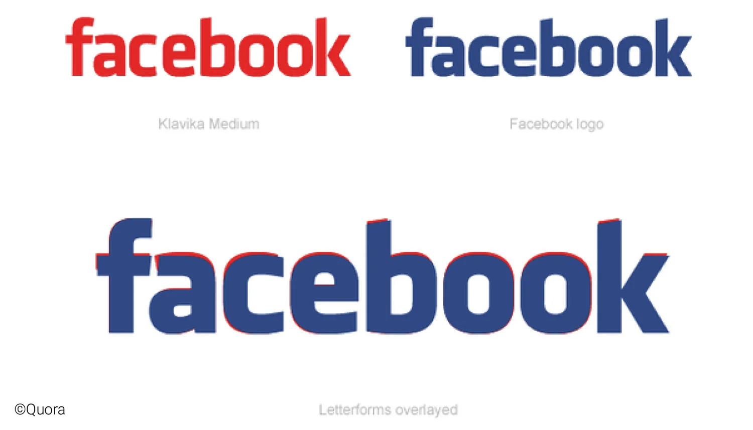
I also highly recommend changing the selected typeface at least slightly in order to create unique letterforms. By doing this, your client will have an actual logo rather than a typeface that can easily be duplicated by anyone typing it out. The Hulu logo below used the Futura typeface but was then modified to create a unique variance, which ultimately creates a well-rounded logo. As you can see with the Facebook logo, the designer started with Klavika Medium as the typeface and modified the letterforms to create forms that better fit the overall brand. Even a slight change can make a world of difference.
8: Logo and Text Composition
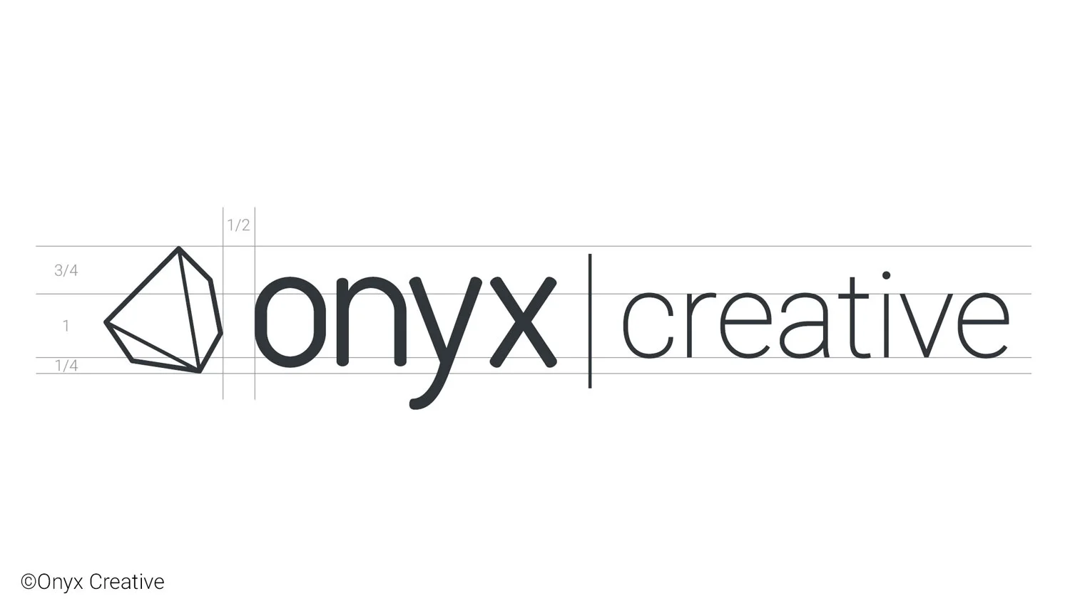
Look at different ways to display the logo icon with the brand name. Should the logo go on top or on the side? How large should the logo be in proportion to the name? This is another way to use the previous gridding technique. Measure out the text and proportionately scale your logo in relation to the other elements you’ve created.
9: Color Influences
Brush up on some color psychology and leap into different inspiration to help inspire your color choices. When we were designing for Burger Guys, we looked at burning charcoals when we developed our color palette. Use the Sherwin Williams Color Snap Tool to help you find paint color matches. They also give you the coordinating RGB codes as a starting point.
10: Better Communication
A simple tip but a good one. Give your clients a progress review every few days if you are working on a larger project. Take their feedback and constantly fuel it back into your work. Let them feel like they are involved and part of the process. This will keep your design progress on track and result in a satisfied and happy client.

