Adding color to a room is one of the quickest and easiest ways to change the look of a space, but is choosing a color for your space really that big of a deal? Why yes, it really is! Color is so much more than the color itself. Color plays an essential role in our lives. It is a visual language understood throughout the world [1]. It occurs naturally in our surroundings and often helps us identify one thing from another. Color is also part of nature's survival kit for the functions of camouflage, attraction, protection, or warning [2].
Color can influence mood and invoke an emotional response. For example, red can mean different things such as love, fire, or anger. Color preference is a self-expression of oneself, whether it is individual, cultural, or generational. Blue might be relaxing and calming to one person while another may find it depressing. White evokes thoughts of cleanliness and purity in America but, in Asian cultures, it is associated with death and mourning. Children often prefer bright saturated colors, while adults appreciate more sophisticated colors.
Color also influences how we perceive things, whether something is farther or closer to us. Is the object heavy or light, small or large? These types of visual cues can help us navigate our way through a space. A strong color, or contrast, draws attention to detail. This is especially helpful in spatial awareness as we age. Strong contrast provides legible cues for the elderly to navigate space. Knowing how influential color can be, deciding on how to color your space can feel like a big decision.
Where does one begin?
Color begins with a general palette. As children, we may color our space on what we know as the primary colors: red, yellow, blue. As we get older, we appreciate the subtleties in colors and understand that mixing the primary colors creates another secondary layer of color: green, orange, purple. Yet we know that there are more than those six colors as we explore the 64 colors in the Crayola crayon box, such as Burnt Sienna, Periwinkle, Turquoise, and Dolphin Gray. Yet how and where do we begin in deciding the color of our space? The first is to understand the basics of color and how they relate.
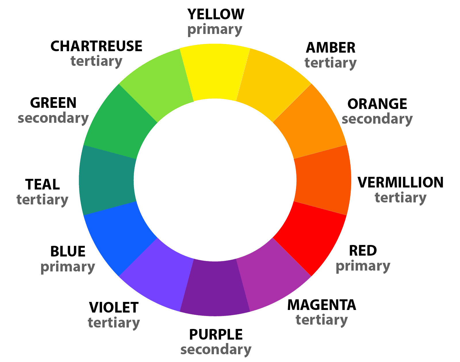
The general color wheel is the best visual tool to understand how colors relate to each other. Primary colors are separated from each other in a triangular format. As mentioned previously, mixing two primary colors makes a secondary color and those are shown between the primary colors. Mixing a primary with a secondary makes the third set of colors known as tertiary. As we move on to mixing another set of two adjacent colors, we get another set of colors and this continues on for an infinite amount of colors.
Now the fun begins.
How do I know which colors work together?
You could keep it simple and plan your space all in one color. The key is doing various shades (light and dark versions) of the same color. This is defined as a monochromatic scheme. Another option is to maintain the general color while incorporating colors from the right or left of it on the color wheel. These sets of colors are referred to as analogous.
Perhaps your space is all cool blue and green tones. Or warm sunny tones varying from orange to bright yellow. Another way to obtain a palette is to look on opposite sides of the color wheel. This creates what is called a complementary color palette. Did you ever wonder why red looks so good on a green Christmas tree? Red and green are complementary to each other. The possibility of color combinations is extensive, so give yourself permission to further explore the color wheel.
Analogous material palette
Complementary material palette
Color has a great impact on our emotions and thus plays a vital role in how one feels within a space. Warm colors energize a space while cooler tones in lighter shades provide a calming spa-like atmosphere.
Blue: Transmits the feeling of positivity, confidence, and security. It is often used in commercial and business spaces, such as banking agencies, offices, and companies.
Yellow: Portrays optimism, curiosity, joviality, and a bright atmosphere. It is used in commercial spaces or restaurants to gain the attention of pedestrians.
Red: This color shows energy, excitement, impulse. Therefore, it is regularly used in commercial spaces, such as stores or fast food outlets, as it portrays a certain compulsivity and consumer desire.
Green: Evokes calm, tranquility, serenity, and well-being. It is used in spaces associated with health and well-being, such as hospitals and relaxation centers.
Orange: The result of the combination of yellow and red, orange projects an idea of intensity, creativity, euphoria, and enthusiasm. It is often used in creative environments, such as offices, studios, and schools. If used together with blue, it conveys the idea of impulsivity and trust, so it is adopted by banking agencies and offices.
Violet: It transmits well-being, calmness, and softness.
Once you have decided on a general color range (hue) for your palette, the next step is to evaluate the amount of that color you want (saturation) and how bright or intense you wish it to be (value). Color saturation and tonal value determine whether a color is perceived as exciting or calming [3].
To invoke a feeling of calmness, choose colors with similar tonal value. The colors do not necessarily need to be neutral.
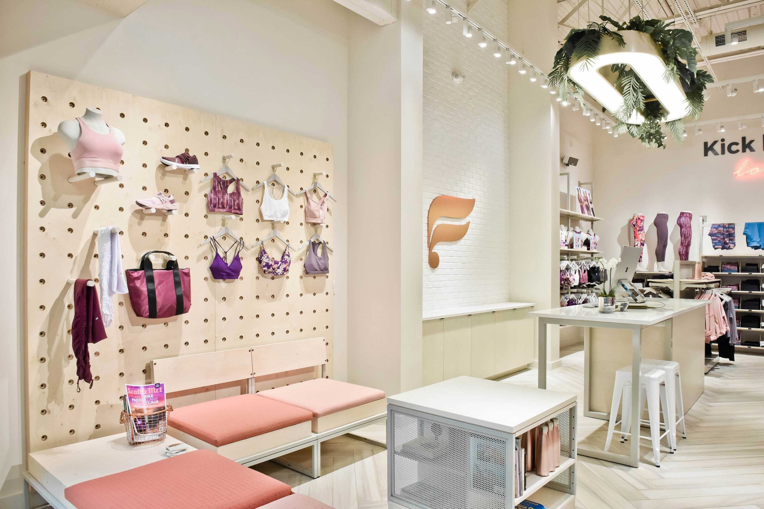
Fabletics Store
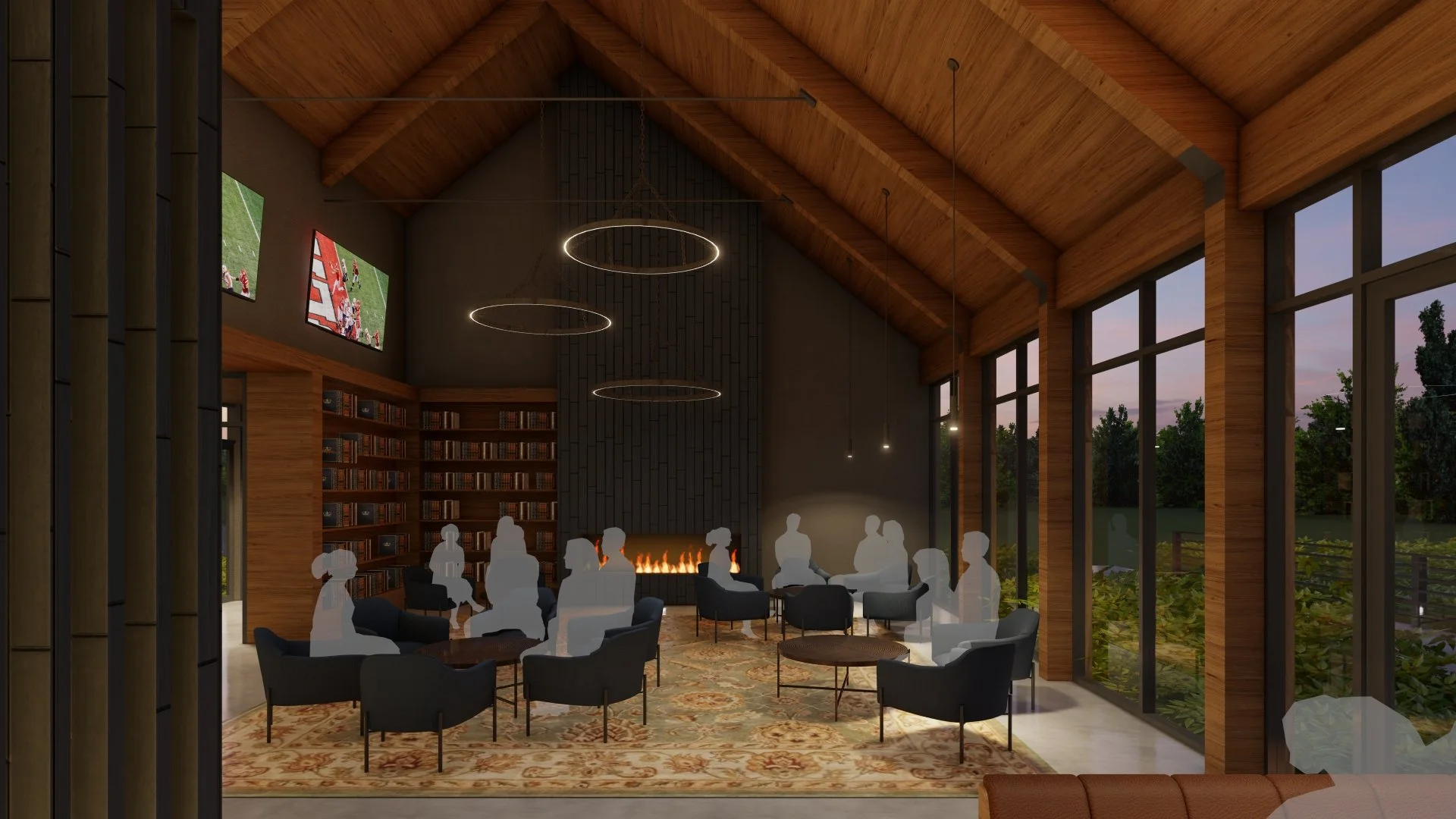
Active areas tend to use more saturated colors with mid-high level contrast, while restful places such as spas use less saturated colors with minimal contrasts.
VASA Fitness
Playing with the value of color can create different spaces. Light colors appear bigger and can make the room seem larger, roomier; dark colors recede which creates a feeling of a smaller more intimate space. A change in hue can help identify transition points or specific areas.
A dramatic space can be achieved using stronger contrast of light versus dark.
Although contrast can provide an impactful space, excessive use of contrast can create visual clutter.
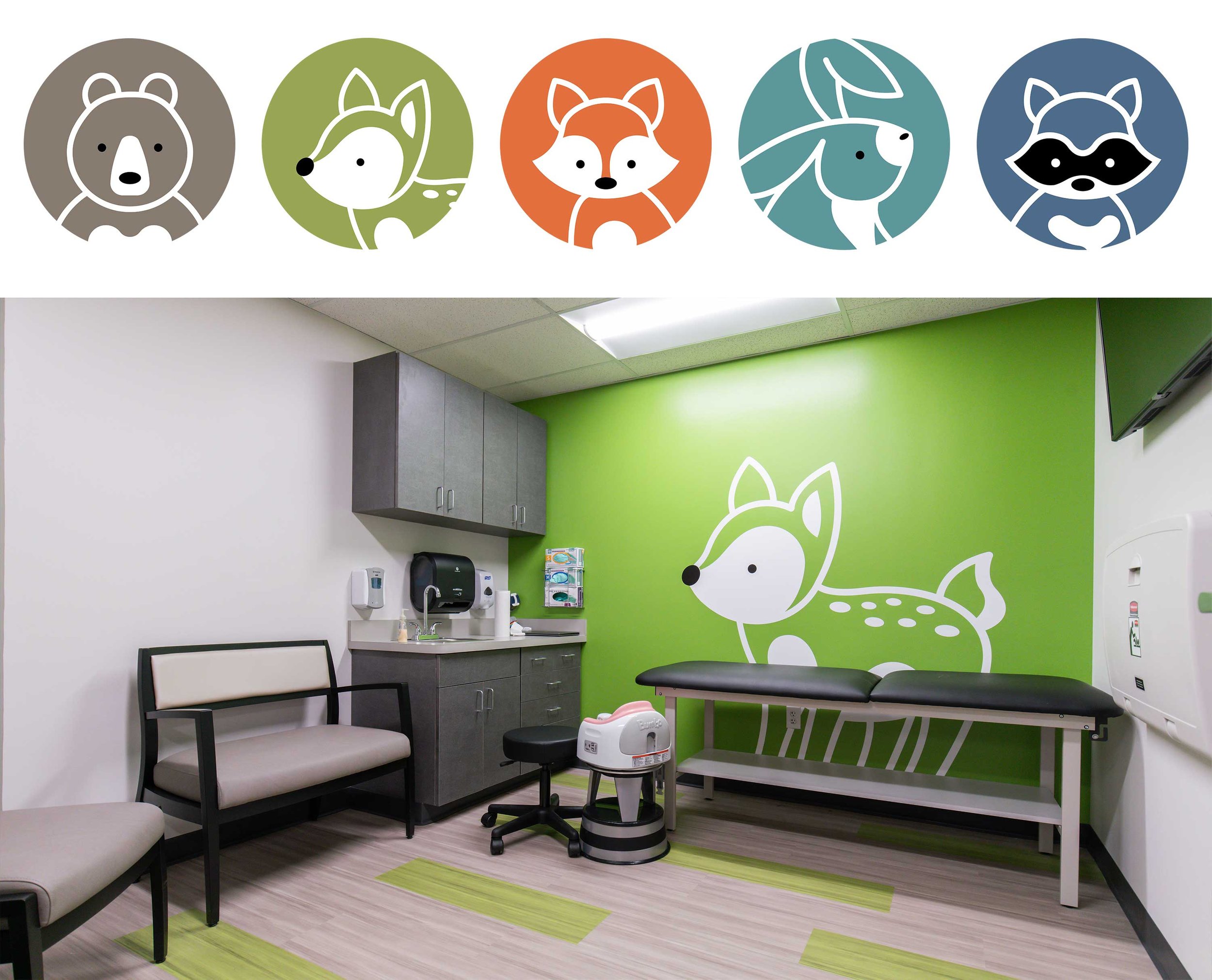
The values and saturation of colors within a space can be the same and still provide a great palette. Notice in all these branding icons that the saturation is the same but the hue is different. Yet the palette evokes a sense of stability and playfulness without being visually loud.
If you prefer a neutral palette, but want to evoke a different mood in one room versus another, then play with the values. One room could use light monochromatic colors while another room utilizes dark monochromatic colors.
Color does not stand alone. It is used within the context of other colors. Choosing the value of a color can depend on what is surrounding it. If the surrounding colors are a light value and you want to draw attention to a particular part of the room or an item within the room, then accent with a more saturated or darker value color.
Sometimes color can appear different than its true color depending on other surrounding colors. In the picture to the left, the color in the square is the same in both images, but due to the contrast and color of the backgrounds, it appears to look like two different colors.
It is important to evaluate color with whatever will be near it since it can change the perceived appearance. As a result of the surroundings affecting color, it is also a great way to provide wayfinding or to define a space.
Color is an integral part of our lives. It is not only important aesthetically, but it also has a great impact on us psychologically. Color has a complexity that must be carefully calculated to create a space that invokes the emotion that we wish to achieve in order to have a fulfilling human experience.


