HOW THE COLOR OF YOUR SPACE IS AFFECTING YOUR MOOD
When you get that urge for change and you want to redesign your room, choosing a color should be the first thing to consider. Your mood can easily be shifted based on the colors that surround you. Warm colors, those in the red and yellow families, have a stimulating effect. Colors in the blue and green families, known as cool colors, have a calming effect. Blacks, whites, and browns fall into the neutral category. These three colors can have warm or cool undertones, making them a great base color to use in any color palette. The brain associates certain emotions with every color on the spectrum. Though every person will interpret colors in their own way, the following is a general explanation of the emotions associated with each color and where these colors might be best used in interior spaces.
COMPARING APPLES AND ORANGES
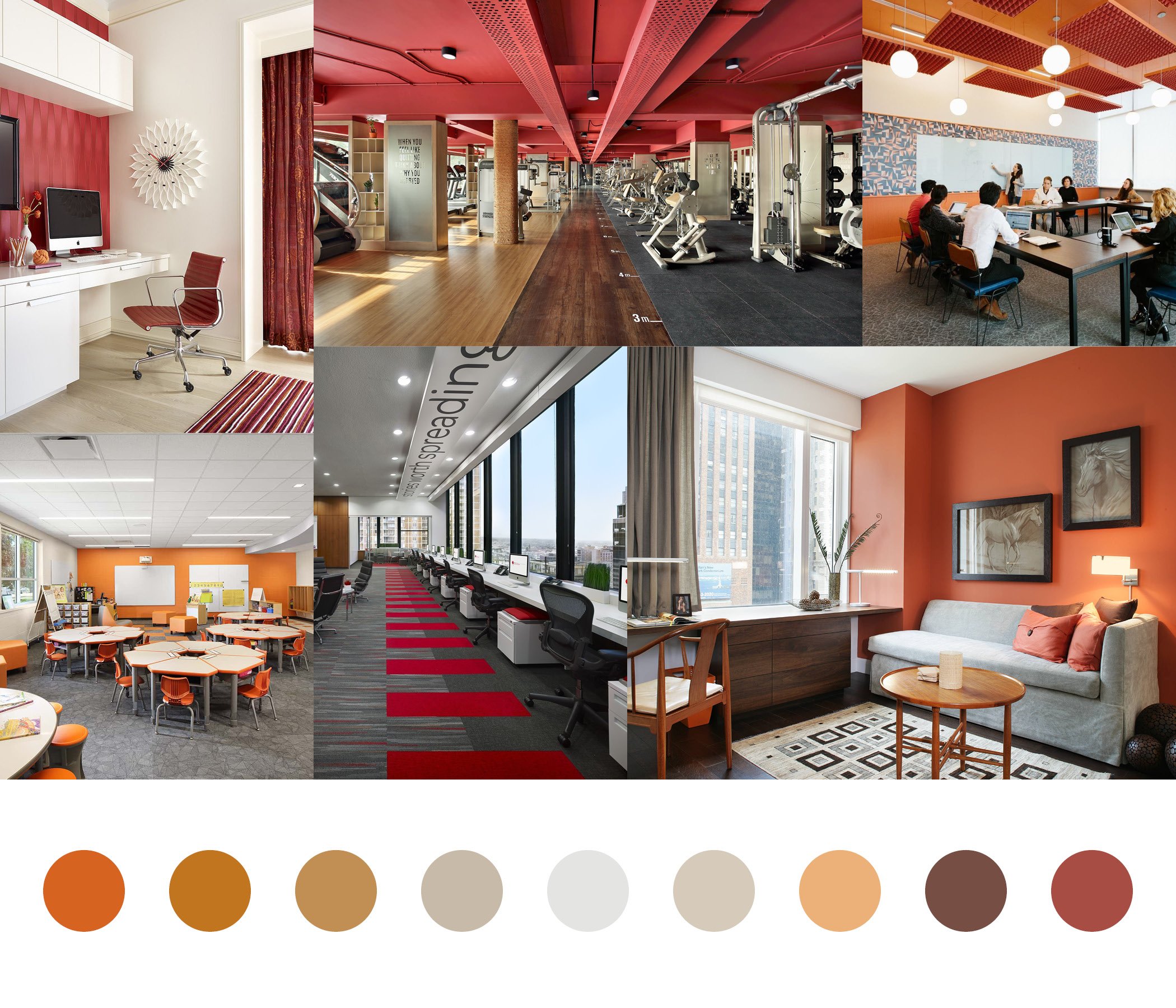
Bring the colors of a beautiful sunset into your spaces with the many shades of red and orange. Reds and oranges have very similar emotional reactions. Both colors evoke strong and energetic emotions. Red, the more intense of the two, conveys love, power, and anger. Being the lesser intensity, orange can still evoke similar emotions, but primarily it causes excitement and a boost in activity and enthusiasm. Because these colors are associated with strong emotions, there are a few ways to evoke these emotions without overstimulating and causing negative effects. They can be used in small amounts as accents to your space, applied using a muted or low saturation color, or in high activity areas such as a gym or game room.
Products used:
Carpet: Interface, Human Nature Collection: 810limestone, 830clementine, 840limestone; Wallcovering: Wolf Gordon, Leicester; Chairs: Knoll, MultiGeneration Stacking Chair; Lighting: Modern Forms, Chaos Linear Pendant
Spaces that work best for these colors:
Gyms
Conference Rooms
Classrooms
Why it works:
These colors promote energy, excitement, and activity. Using them in these environments will help promote creativity in a conference meeting and high energy while working out in a gym. Be cautious about using too much red/orange, as to not bring out anger and frustration in people. These colors can get overstimulating fast if there is too much or if too intense of a shade is used in the space.
TICKLED PINK
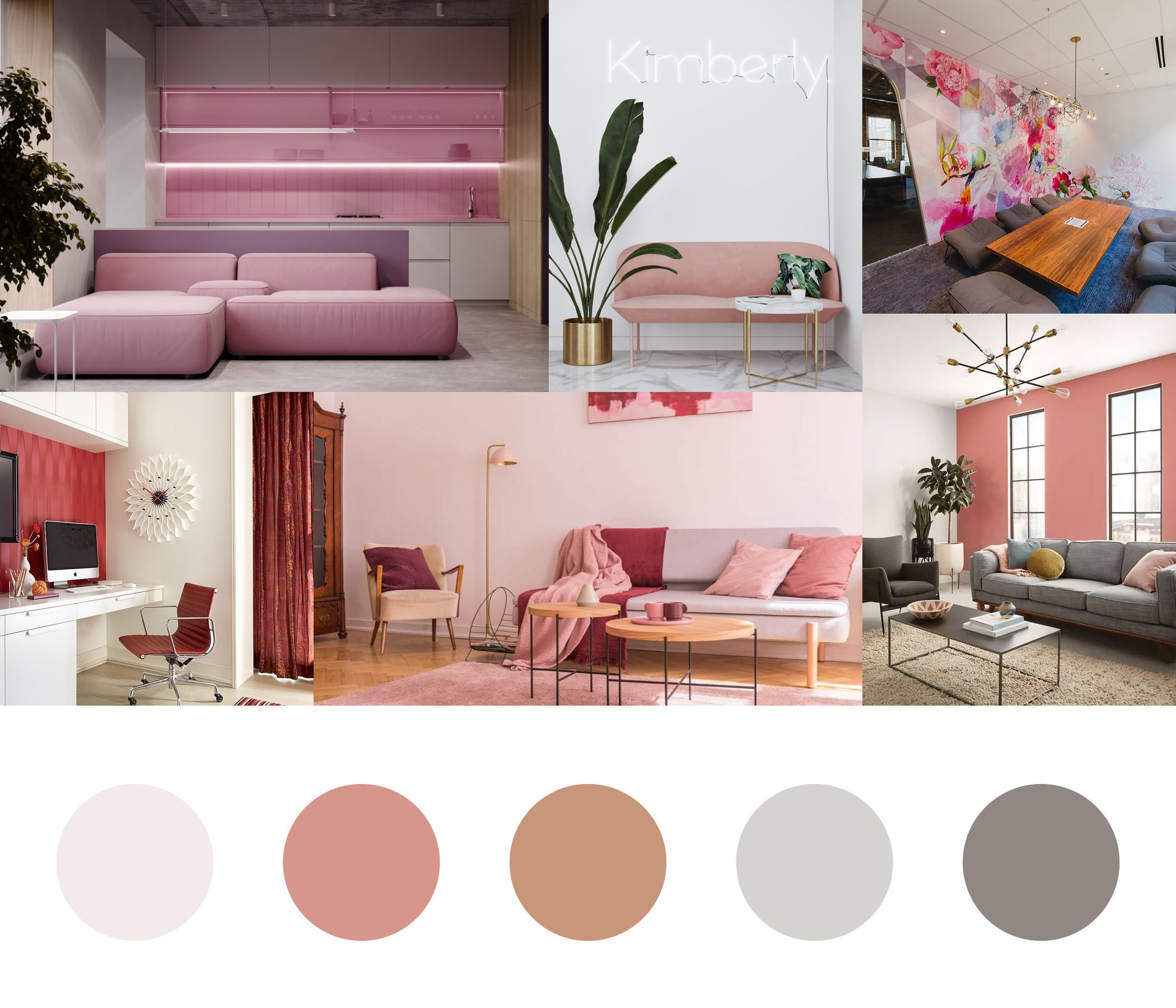
Love is in the air when designing with pink. This color brings out love and kindness in people and will also have a calming effect when you surround yourself with the color pink. If you are stuck in a creative slump, bringing pink into the space can boost your creativity and get ideas flowing. Because there are many great tones and shades of pink, this color is versatile in almost any space. The calming nature of this color makes it a great choice for nurseries, bedrooms, and living rooms. Design of offices and meeting rooms can benefit greatly incorporating pink both for its creativity boosts and calming benefits in tense situations.
Products used:
Carpet: Flor, Among the Wildflowers; Wall paint: PPG, Holland Tile ppg1064-5; Chairs: Hon Mav, High Back Chair; Lighting: Louis Poulson, PH 5 Pendant Light
Spaces that work best for these colors:
Living Rooms
Offices
Nurseries
Why it works:
There are many positive responses brought out when pink is used in a space. When you need to relax and de-stress, lounging in a comfy pink chair can help you do just that. When you need that little pick me up when in a creative slump, try incorporating something pink in your work environment such as new art or changing your computer background.
IT WAS ALL YELLOW
Like a ray of sunshine on a cloudy day, adding yellow in your spaces can be a big mood booster. Yellow is the best color to use when you want to stimulate positive emotions and creativity. Incorporating this color into offices, kitchens, and classrooms will create a happier environment to work in and can lead to creative ideas and solutions. Because yellow is very bright, it also works well as an attention grabber. If you need to highlight a designed element or bring people into a space, adding yellow in bold ways can draw people in quickly. Even using small amounts of this color in creative ways can add pops of color and really brighten up a room.
Products used:
Flooring: ShawContract, Terrain Shade; Wall Tile: Buderim Carnaby Pietta Donovan Walker Zanger Tile; Lighting: Moyen, Rectangle Eau de Lumière LED Chandelier Designheure
Spaces that work best for these colors:
Kitchens
Dining rooms
Break rooms
Why it works:
Happiness has a close relationship to the color yellow. Designing around this color can be a great way to bring joy and creativity into a space. Imagine starting your day by making breakfast in a yellow kitchen and putting yourself in a good mood to have a great day. If you need to sit down and put an idea together with your team members, try meeting in a room with some yellow in it to boost everyone’s creativity.
A GREEN THUMB
You don’t have to be a plant expert to bring green into your designs. The many shades of green can bring life to a space. Of all the colors on the spectrum, green is the easiest on the eyes. Because of this, green is associated with balance and restfulness. Having this calming nature allows for this to be a great choice in any space, especially living rooms, break rooms, and bedrooms. Green is also related to plants and nature. By using certain shades of green and natural patterns, you can achieve a biophilic design that can bring people closer to nature, even if you are not able to use real plants in the space.
Products used:
Flooring: ShawContract, Dialogue Coded Connect; Carpet: Living Systems, Transform Color Tile Untamed Forests; Wall paint: PPG, Bermuda Sand ppg1074-3; Chairs: Knoll, Tulip Chair
Spaces that work best for these colors:
Breakrooms
Bedrooms
Living Rooms
Why it works:
Green is one of the most versatile colors on the spectrum. The balanced nature allows this to be a great color choice in almost any type of space. Having green in a break room creates an important space for employees to de-stress. Coming home to a bedroom that incorporates green into its design can help calm you down and ease you to sleep.
OUT OF THE BLUE
Being blue doesn’t always mean you have to be in a sad mood. There are many bright and fun blue hues that can stimulate your brain and help you focus. This color not only works in spaces where you need to focus in such as classrooms and offices but adding a bright blue to a waiting room or restaurant can add a fun pop of color to liven up a space. The other side of the blue spectrum includes dark and rich shades of blues. Similar to green, these blues are soothing and relaxing. This color has been proven to lower your blood pressure and slow your respiratory system, making relaxation come easy. Not only that, but rich blues can create a bold statement area in your home or waiting room.
Products used:
Carpet: ShawContract, Archway Mural; Wallcovering: Wolf Gordon, Aquatint Ocean; Bed: All Modern, Loftus low profile platform bed; Lighting: Alder & Ore, Bery Table Lamp
Spaces that work best for these colors:
Classrooms
Bedrooms
Offices
Why it works:
Imagine crawling into bed and falling asleep in a sea of calming blue or getting into a groove on a project while at the office. The wide range of light and dark blues can provide all of those feelings when incorporated into spaces around the home or office. This color can create a sense of calm and focus when you are in the midst of blue environments.
PURPLE PATCHES
Feel like royalty and put a purple accent in your space. Just like its close relative blue, the different shades of purple can have a different effect on you. In this case, the lighter tints of purple help create a calming environment. These shades help to create a sense of well-being and gentleness. Where purple differs from blue is in the darker shades. Adding rich purples to a space creates a dramatic and sophisticated environment. Having your guest waiting on a deep purple couch or in a dining room with an elegant purple wall as a backdrop will not only make your space appear regal but will also do the same for them.
Products used:
Carpet: ShawContract, Share Empathy; Wallcovering: Wolf Gordon, Flora Petal; Furniture: Knoll, Florence Knoll Settee Crossroad Iris
Spaces that work best for these colors:
Breakrooms
Living Rooms
Offices
Why it works:
Purple is a double threat when pulling a space together. You can imagine a soft lavender color on the walls of a bakery, along with the smell of sweet cakes and cookies, creating a soothing environment. While on the opposite side of its spectrum, you can imagine being in an elegant restaurant with rich purple tablecloths and hanging wisteria flowers adorning the walls. This environment instills a regal and sophisticated environment.
ON NEUTRAL GROUNDS
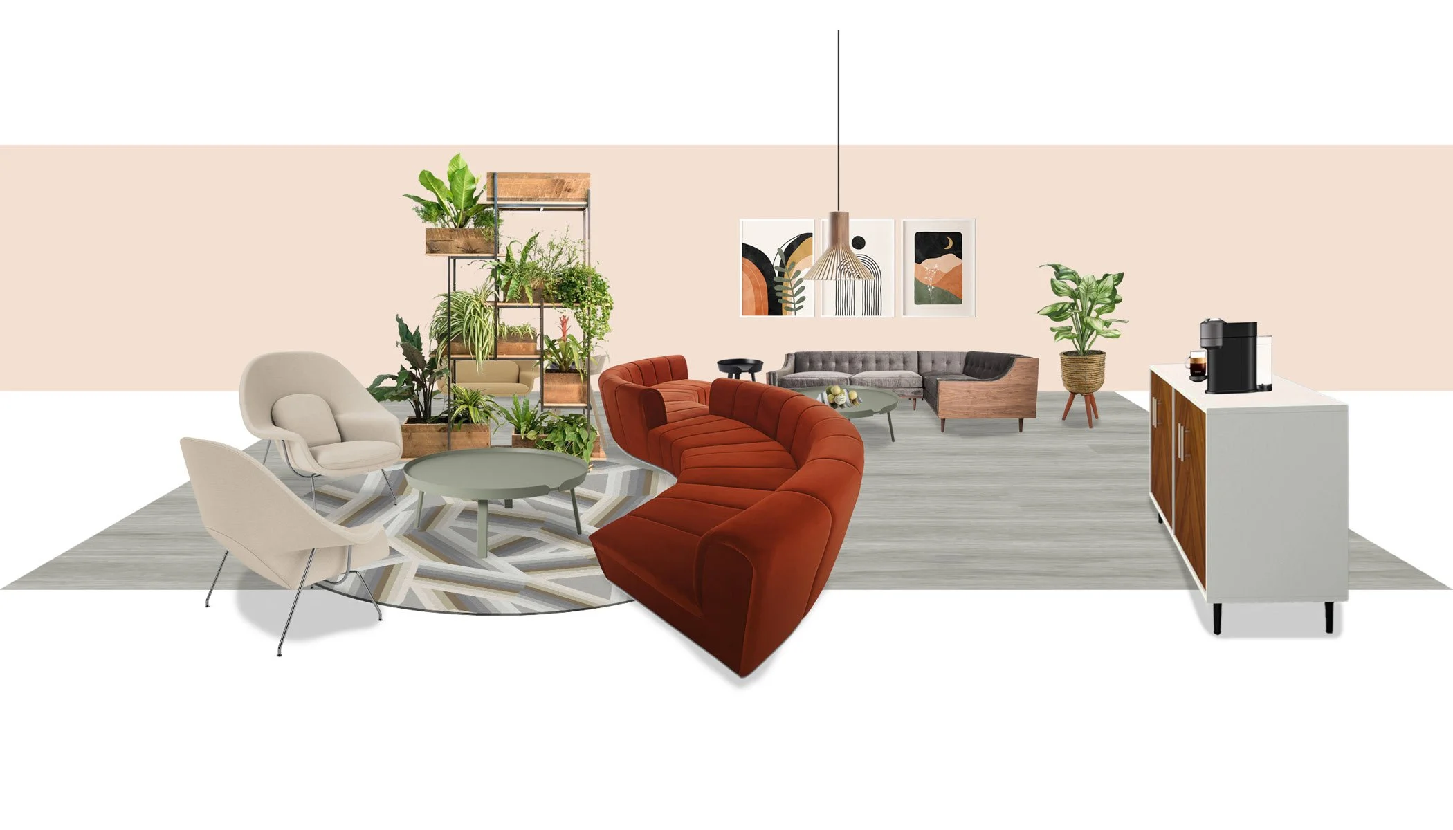
Just like a hot cup of coffee on a cold day, neutral colors can add warmth to any space. Browns, tans, and creams can be used as accents to make the main color stand out or to give variety to the color palette. Neutral colors can also be used to create a palette all of their own. These colors can create comfortable and cozy environments, perfect for waiting rooms and living rooms. There is a wide range of materials that can naturally bring in these colors, adding to the warm and cozy feel. Leathers, stones, and woods all add to the neutral palette while also providing their own unique textures in the design. Because they can be used as accents and all on their own, neutral colors can work for any space you are trying to create.
Products used:
Carpet: ShawContract, Ribbons; Furniture: Knoll Womb Settee, Mod Shop Cobra Modular Sectional Piece, Lautner Sectional Brussels Sky Grey Velvet, Muuto Around Side & Coffee Table; Lighting: Puncto 4203 Pendant Light by Seppo Koho from Secto Design
Spaces that work best for these colors:
Waiting Rooms
Living Rooms
Any Space
Why it works:
Neutral colors are like sitting wrapped in a blanket next to the stone fireplace while drinking hot tea. You feel comfort, warmth, and coziness. Neutrals can bring those feelings into any color palette and any space. Using these colors in waiting rooms and living rooms provides comfortable spaces for people coming in.
THE BLACK SHEEP AND WHITE ELEPHANT
It’s not as simple as black and white; it’s everything in-between. Due to the ability of these colors to be used as accents for any color, one could group these colors into the “neutral” category with the browns and beiges, but black and white hold a category of their own. The white spectrum provides a clean and classic feel while the black spectrum adds grounding and an edge to the palette. With gray you get the best of both worlds with a large variety of shades. These colors can also give depth to a space. While white can make a space look larger, black (used sparingly) works to give context and grounding. When you combine all of these into one palette, you get a very clean, modern, and elegant look to any space.
Products used:
Flooring: Bond Venom Black 12x24 Matte Porcelain Tile; Furniture: Romer 72” Wall-Mounted Double Bathroom Vanity Set, Treece 62” x 31” Freestanding Soaking Acrylic Bathtub; Wall Tile: Zeal Ogassian 3D 6” Hex White Matte Porcelain Tile; Lighting: George Kovacs, Tube 5040 Bathroom Wall Sconce
Spaces that work best for these colors:
Kitchens
Bathrooms
Any Space as Accents
Why it works:
Imagine a black-tie event or a white wedding. Black and white in any context make for an elegant and classic environment. Kitchens and bathrooms use this palette for those same reasons. When done right, black and white color schemes can make any space modern and high class.
Sources
Photocollage Sources
COMPARING APPLES & ORANGES
· https://www.pinterest.com/pin/AYhl8CjbK9Fv9tC-7tn2zYSSzc59LD-LKGDOKTUwxwmcIv9BjoLrQC4/
· https://www.houzz.com/photos/red-home-gym-ideas-phbr1-bp~t_751~a_88-1
· https://www.decoist.com/red-home-offices/?chrome=1
· https://www.wework.com/ideas/workspace-solutions/flexible-products/10-conference-rooms
· https://www.prarch.com/projects/school-district-of-hartford-joint-one-elementary-school/
· https://www.houzz.com/photos/home-office-with-orange-walls-ideas-phbr1-bp~t_732~a_46-338
TICKLED PINK
· https://homedecorbliss.com/pink-living-room-ideas/
· https://www.digsdigs.com/pink-accent-walls/
· https://www.chicagobusiness.com/static/section/coolest-offices-2016.html
· http://www.home-designing.com/taking-pink-and-purple-interior-design-from-sublime-to-outrageous
· https://thesalonbusiness.com/hair-salon-designs/
IT WAS ALL YELLOW
· https://www.spectorgroup.com/project/honeycomb-asset-management/
· https://www.ikea.com/us/en/p/melltorp-janinge-table-and-4-chairs-white-yellow-s39161488/
· https://k2space.co.uk/knowledge/the-colour-of-office-design/
· https://stylebyemilyhenderson.com/blog/on-our-radar-yellow
A GREEN THUMB
· https://meritinteriors.com.au/5-examples-office-interior-design-colour-schemes/
· http://www.home-designing.com/green-living-room-interior-design-ideas-photos-inspiration
· https://workspacepartner.com/office-breakroom-ideas/
· https://www.fabmood.com/inspiration/green-and-taupe-living-room/
OUT OF THE BLUE
· https://scottbrownpainting.com/10-best-office-paint-colors-to-improve-productivity/
· https://www.pinterest.cl/pin/ASxhZquuuUCqj3vwWOEutx-AiUql4CorCxqk9PuB7PVEUufPjTEvG30/
· https://www.pinterest.com/pin/487585097155897873/
· https://www.cocokelley.com/2017/07/emerald-studio-project-office-makeover-the-mine/
· https://www.architecturaldigest.com/gallery/best-designed-bar-each-state
PURPLE PATCHES
· https://www.pinterest.com/pin/446278644294904860/
· http://www.home-designing.com/purple-bedroom-design-ideas-tips-photos-inspiration
· https://www.housebeautiful.com/room-decorating/colors/g13532290/purple-rooms/
· http://www.home-designing.com/taking-pink-and-purple-interior-design-from-sublime-to-outrageous
· https://www.pinterest.ie/pin/381820874655316835/
ON NEUTRAL GROUNDS
· https://www.bhg.com/rooms/bedroom/color-scheme/bedroom-colors/
· https://www.venuereport.com/roundups/30-spectacular-spots-in-san-diego-to-host-a-bachelorette-party/
· https://www.benco.com/office-design/
· https://www.cntraveler.com/gallery/the-best-hotels-in-the-world
· https://www.shopify.com/blog/why-support-small-businesses
THE BLACK SHEEP AND WHITE ELEPHANT
· https://www.mydomaine.com/modern-kitchen-ideas
· http://www.lj2interiors.com/
· https://www.tileclub.com/blogs/news/geometric-bathroom-tiles-and-styling-inspiration
· https://cyclingtips.com/2018/11/ten-of-the-worlds-coolest-bike-shops-2018-edition/
· http://archdeena.blogspot.com/2016/07/interior-design-clinic-reception-and.html

