Crossroads Health — branding and identity Design
After forty years, Crossroads had become one of the largest mental health service providers in Lake County by providing behavioral and mental health services for thousands of children, adolescents, young adults, and families. As the agency grew, it aspired to help more people in more ways.
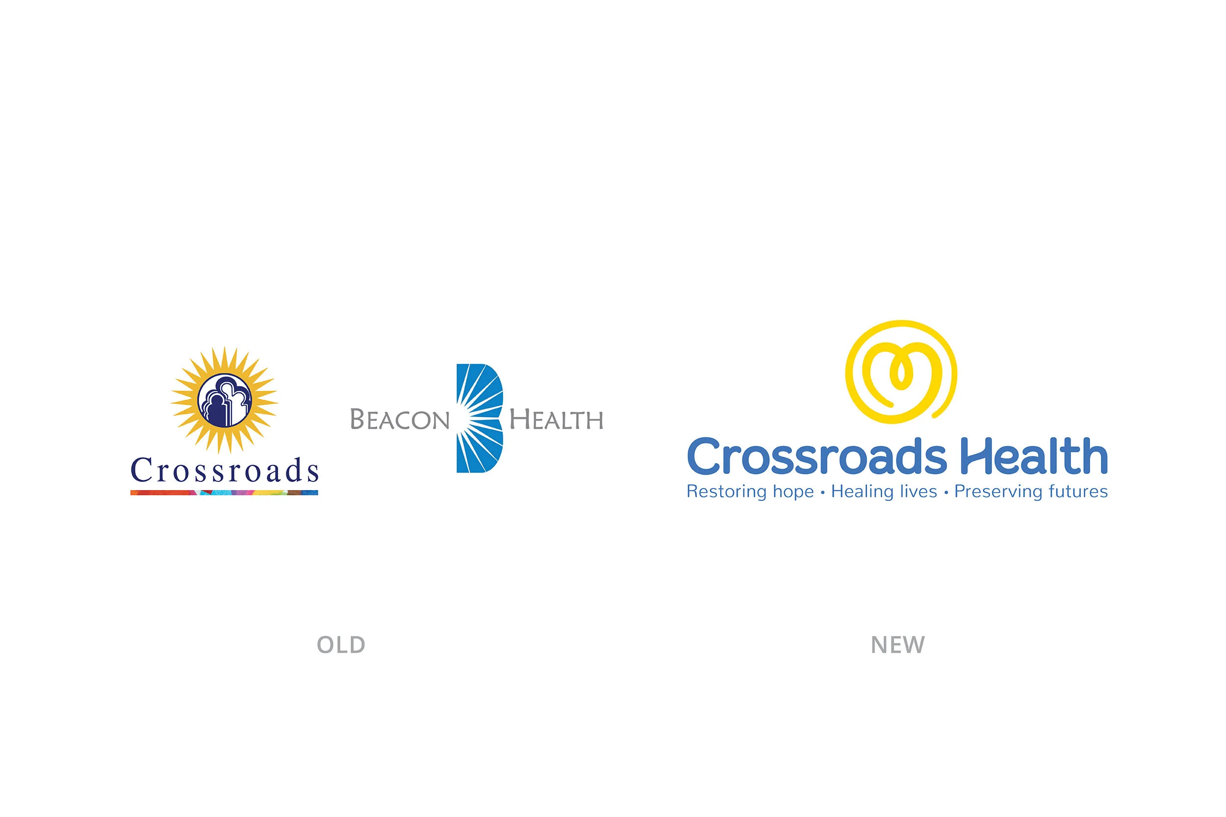
Crossroads merged with Beacon Health in 2018, allowing them to offer these life-changing services to adults. This merger presented the opportunity to rebrand themselves as a new entity and to reevaluate their focus and market. We worked collaboratively with their core project team to develop their new range of services, creating an identity that better defines their brand story and future vision of serving everyone, at all ages and stages of life.
Client | Crossroads Health
Type | Branding, Logo Design, Identity, Collateral
Awards | Gold Award, Print Media Design, Marketing Materials | Hermes Creative Awards
We first assessed their overall mission, vision, and core values, and worked together to establish their brand voice and messaging. Their established brand voice and tone is like speaking to a good friend, someone that is honest, positive and encouraging.
The new logo mark embodies their empathy, passion, and purpose to help everyone, while also referencing THE sun shape from their previous logo designs. The loop inside the heart resembles an awareness ribbon, and the varying line thickness represents a personal journey.
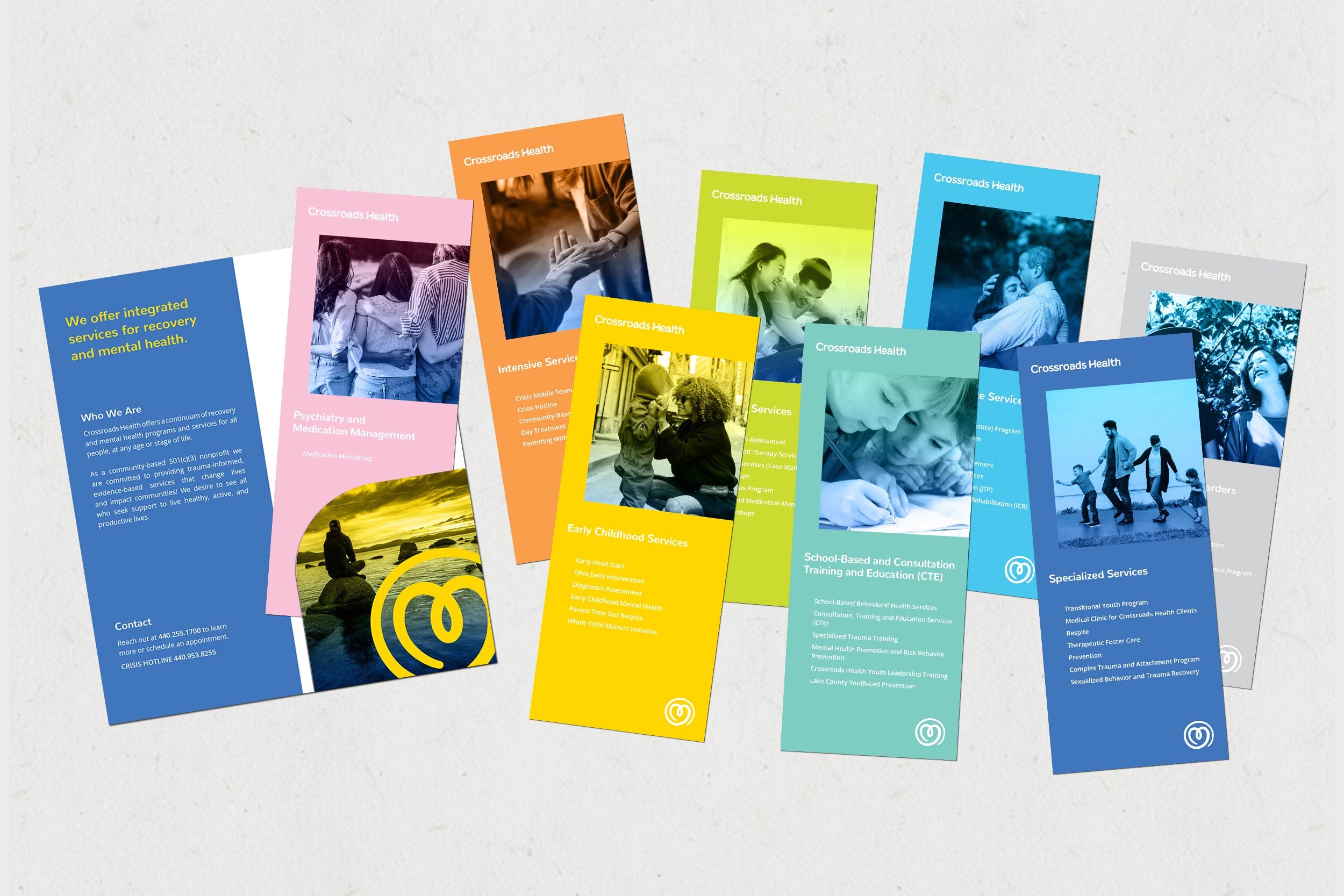
A contrasting color family was developed to represent the different mindsets and stages of mental health. It’s a way of celebrating individuals and dually supporting their inclusive organization. The colors chosen reflect their bold, friendly and, optimistic brand personality.
This celebration of color IS reflected in every marketing material; including photography, digital, print, and swag. Employees were encouraged to select business cards in one of the six accent colors, engaging them in the rebranding process.
We worked closely with their website developer to create page layouts that incorporated the new color scheme and coordinated this color scheme into their brochures. Check it out at crossroadshealth.org
We developed a robust brand guidelines book to train the client’s staff on logo usage, tone of voice, art direction, and more.
The new brand has received praise from across the organization as well as from clients and their families on social media.


